


THE OPPORTUNITY
Updating everything from brand language, logo, packaging design and photography styling myself and the team at Clever Creative ultimately positioned Power Crunch for new retail exposure and success.
ROLE
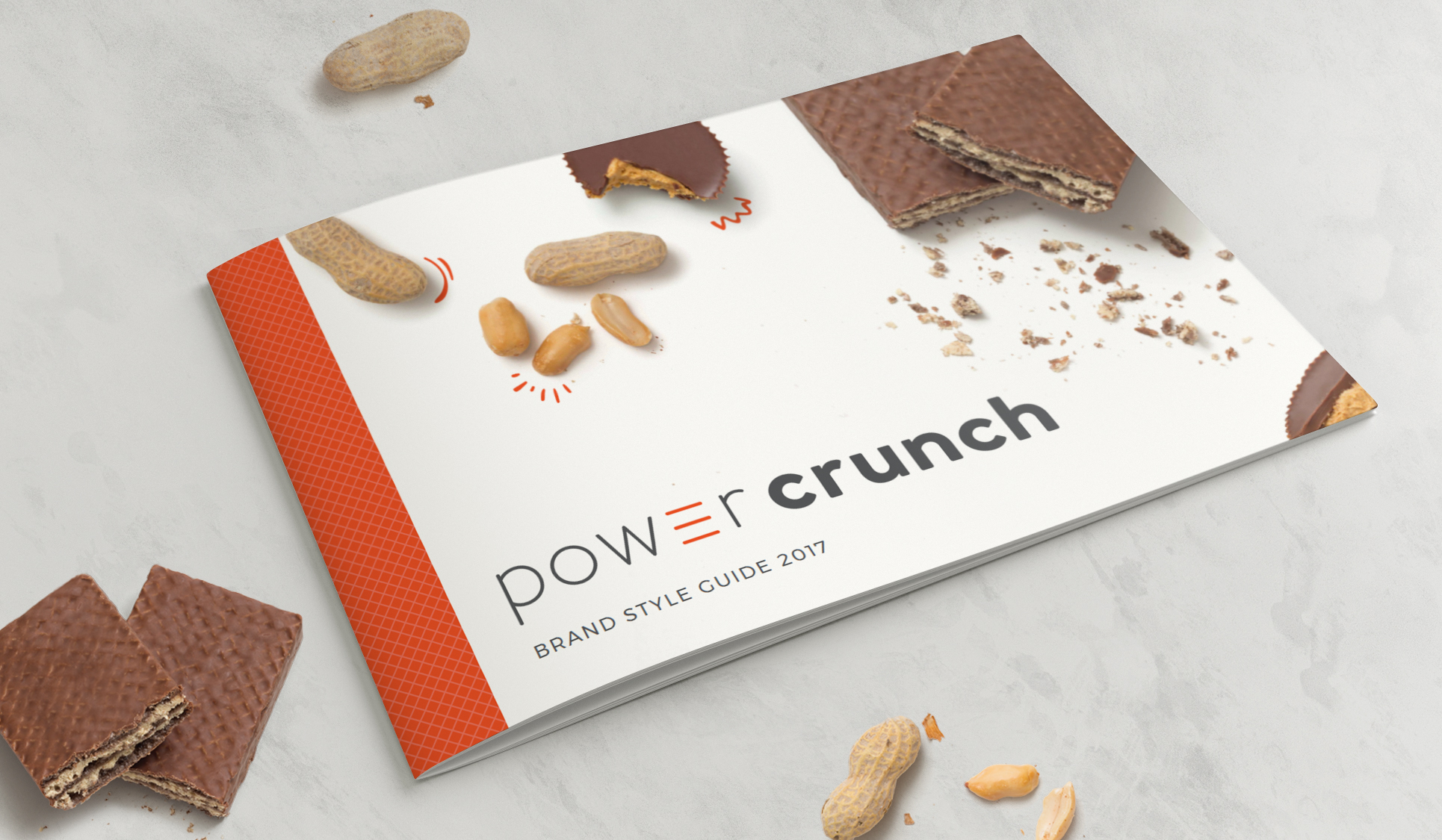
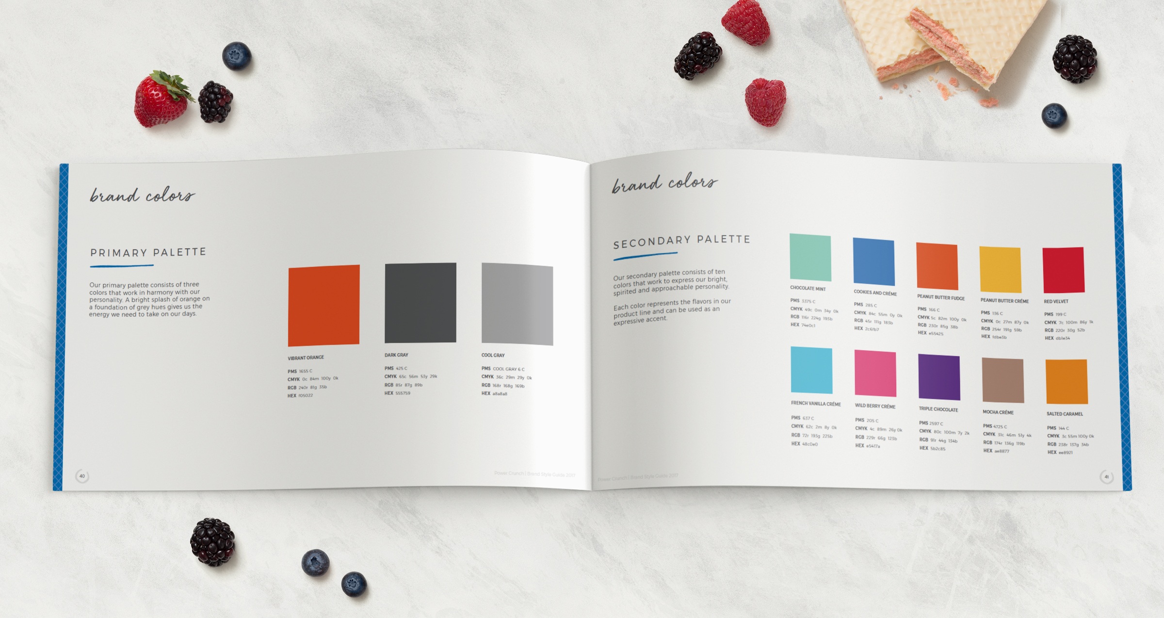
Brand Identity Refresh, Photography Direction, Packaging, Style Guide
CREDITS
Agency: Clever Creative
Creative Director: Amy Wilk
Art Director: Emily Zarnow
Designer(s): Emily Zarnow
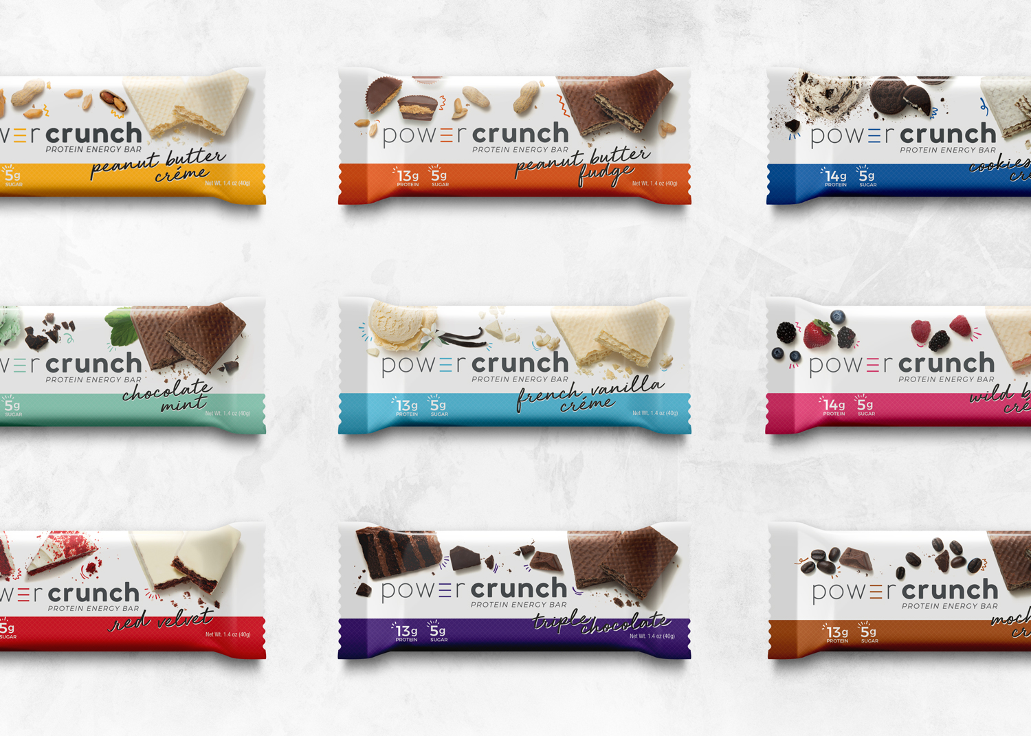
By streamlining and modernizing the new logo, we created a mark that is clean, friendly and bold. Establishing the “elevated e” that lives within the logo mark and also stands on iconically its own, giving the brand a distinctive element that pays homage to the bars tasty, wafer layers.
While the work that was done was only a "refresh," these inspiring design updates elevated the Power Crunch brand both digitally and on shelf. By providing the Power Crunch team with an extensive style guide that encompassed everything from positioning and brand language to photo styling and graphic assets, we were able to set them up for a long run of great success.